The main idea is to found the air pollution and other factors that determine the contamination of the air and transfer all of this data to different graphics.Also, we use the data to determine if our city is with high levels of contaminants or not and if the city could do something to improve it. In addition, the other objectives are have more idea to how to use the R stuido and all of their functions and also to know the most important libraries.
R studio is a application focused on the management of a big quantity of data, and to make it easier to see,they create graphics with this data. The libraries Open Air, Lares, Tidyverse and Ggplot2 are extensions of the application R Studio that complement it with more functions and to make easier the management of the data making graphics. Open air it's a library that has developed over several years to help analyse atmospheric composition data; initially focused on air quality data. In addition, this library also has a lot of utility funcions to make plots and roses that it's very useful to do it more understanding.The Lares is a library used to automate, improve, and speed everyday analysis and machine learning tasks. It also simplifies the installation process of libraries, distribution, and reproducible research.Ggplot2 is a system for declaratively creating graphics, based on The Grammar of Graphics. You provide the data, tell ggplot2 how to map variables to aesthetics, what graphical primitives to use, and it takes care of the details.The tidyverse is an opinionated collection of R packages designed for data science. All packages share an underlying design philosophy, grammar, and data structures. Also, we used a lots of webs and more sources to found information about the graphics and how to use R and all of the libraries. For the main part of the project we need to use the "dades autosomiques " and we done a CSV called City that has all the information that later we extract to make the graphics to know the values of the pollutants in my city and also other data like the direction of the wind or the velocity. The codes used to do the graphics and to managament all of the data. The main code is used from the web of our teacher. To finsish, we need to search the data in to a web called XEMA that is a data base with a lot of data of the pollutants and others of a lot of cities of Catalonia.
In the figure 1, the NO2 in the graphic of the yearly is overpassed in the most of the years. So, following the EU limits, the NO2 is between 2009 to 2018 overpassed the level of 40.
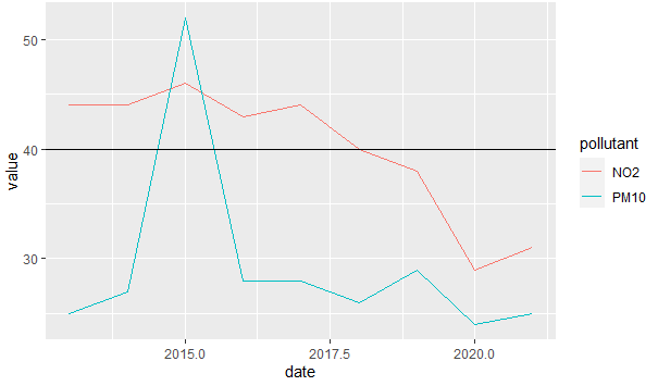
In the figure 2, The levels of NO2, PM10 and NOX are exceeded and NO2 for so long. This reaforce the graphic number 1 that indicates the exceeded levels of NO2.
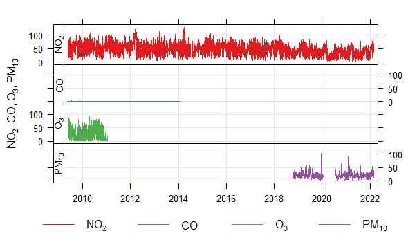
In the figure 3, is done the plot of the daily contaminants of NO2, PM10, O3 and CO. The level of NO2 again is present in all of days and with a big quantity. The level of CO is so low and the level of O3 in the beginning is quite significative but then is very low. Finally, the level of PM10 is only present in the last years.
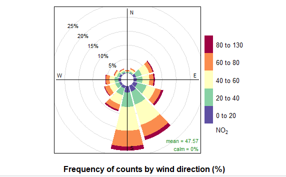
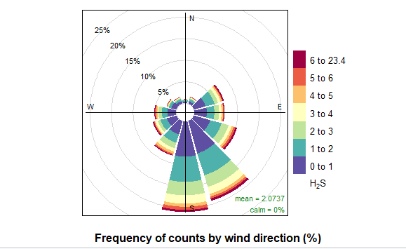
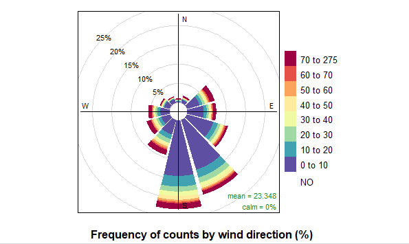
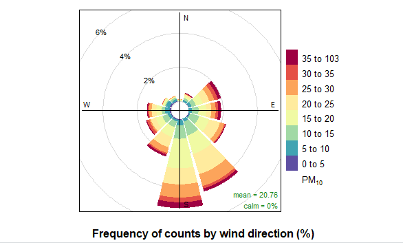
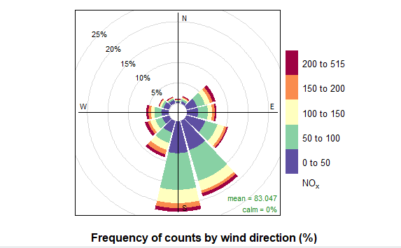
In the figure 4, is a Pollutant Rose that determines the quantity of NO2 is in the air and if what direction it goes, the levels of the pollutant are represented with diferents colours. This influences depending on the geographic location and in the usual movement of the wind. There are also the rest of the Pollutant Rose about the pollutants that are more significatives in my city, that are the NO2, the H2S, the NO, the PM10 and the NOX.
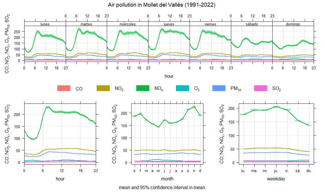
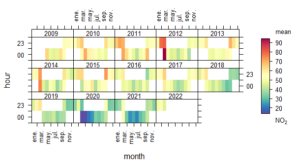
Other graphics like fig 5, are made to found quickly the yeras, or in this case, the month, that the pollutant in specific is when there is more quantity, and it is made with a legend of colours that goes to blue, the minimum level of the pollutant to red, the maximum level. In the case of the NO2, it can be apreciated that in the last years it had been reduced, in the same way we saw in the first graphic. If the fig 5 has more extension to previous years we could apreciate more red in those years, because in the past the levels of the NO2 were extremly high.
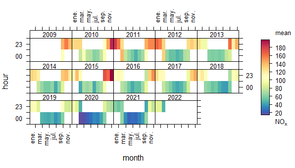
Other pollutant that it also has a important impact and a high numbers is the NOX. Is a pollutant that happens more or less the same thing that the NO2, in this recently years the level of that pollutant has dicrease a lot. In this case, the level it started to decrease in 2016 that has quite red month and from there there are not quite red months and are more blue ones. In comparation with the NO2 graphic, this has minors levels.
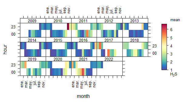
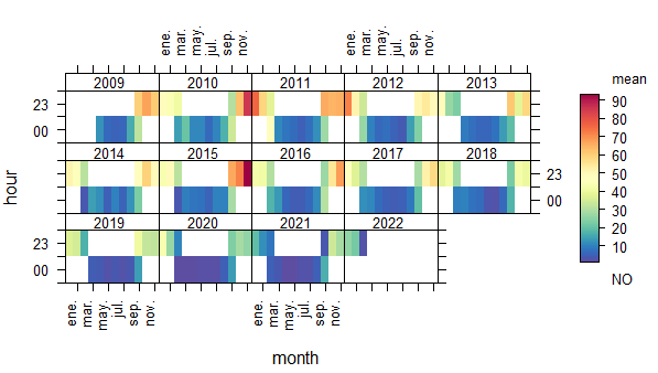
Finally, the Pollutants H2S and NO with the same plot, result that also have levels but in a lot of minor. All the months are the colour of blue and green except the oldest years that had more red in some months, but in the same way that in the other graphs we appreciate a high decrease, in these they remain the same over the years or had a quite decrease that have a little of impact in the city.
- The levels of NO2 are exceeded by 51,07% in a day, in and hour is not exceed by 100%.
- The levels of PM10 are not exceeded by a 100% in a day.
-The levels of O3 are not exceeded by a 100% for 8 hours and also in a day.
-The levels of NOX are not exceeded by a 98,34% for 8 hours.
-The levels of CO are not exceeded by a 100% for 8 hours and also in a day.